Better Money Habits
Better Money Habits empowers users to learn about money through approachable content. The homepage refresh clarified hierarchy, improved discovery, and modernized layout patterns for consistency.
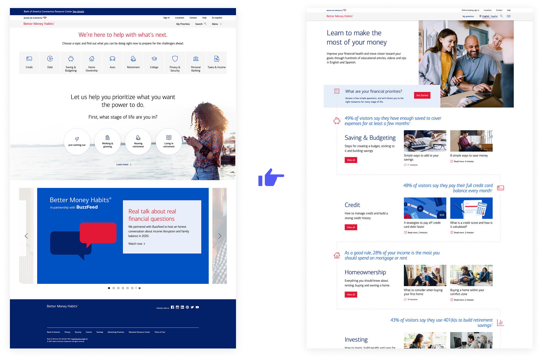
The homepage gave users little value, using prime space for a low-engagement carousel. It failed to convey the scope of Better Money Habits’ learning resources or or help users know where to begin.
An iterative, test-driven approach
Experience audit
The team tested the existing homepage to uncover usability issues, content gaps, and unclear interactions.
Analytics review
Site analytics were analyzed to identify behavioral drop-offs and inform clearer requirements for redesign priorities.
Wireframe exploration
Early wireframes explored new structures, focusing on hierarchy, clarity, and goal-based navigation paths.
Wireframe validation
Low-fidelity prototypes were tested with users to confirm findability, label clarity, and navigation flow.
Visual design
Visual treatments applied enterprise design system standards, refining hierarchy and accessibility.
Final testing
The updated design was validated through usability testing to confirm comprehension, engagement, and task success across devices.
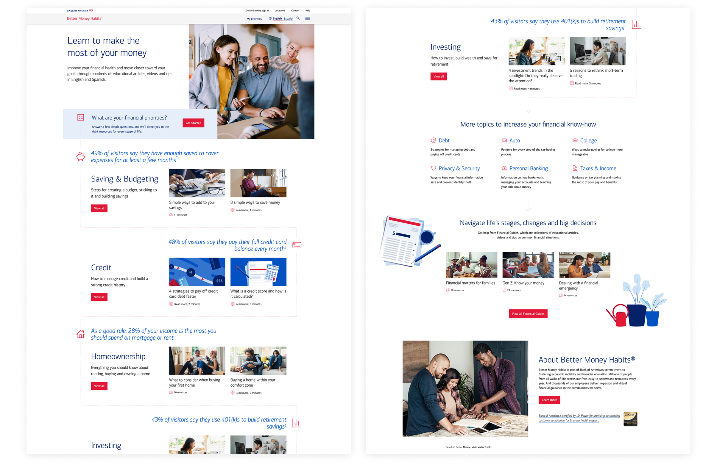
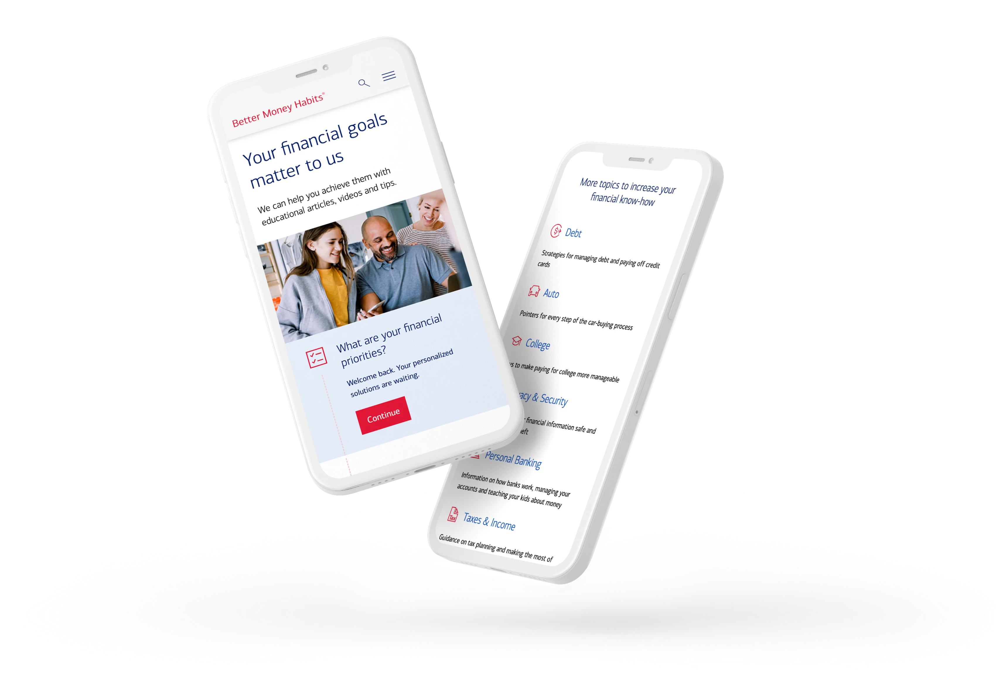
From passive to purposeful
The redesigned experience replaced low-value space with clear, goal-based entry points that made learning approachable and intuitive.
At the top of the page, a simple three-question quiz offers users immediate, personalized guidance on where to begin. Rather than presenting topics in a passive lineup, the page highlights one topic at a time as users scroll, with curated resources serving as entry points for deeper exploration. This approach gives the four most-visited topics prominent placement, while other topics are accessible further down the page.
Below that, users can browse resources organized by life events and life stages. By the time users reach the end of the page, they’ve been offered multiple pathways into the content, each with clear guidance on what to expect.
Outcomes & impact
Usability testing confirmed that the redesigned navigation made content easier to find and understand. Participants described the experience as simple and intuitive, and clearly recognized Better Money Habits as a financial education resource.
Clarified purpose
Test participants immediately understood what Better Money Habits offered as a financial education resource.
Stronger hierarchy
The new layout highlighted key topics, giving users a clear place to begin.
Higher perceived value
Test participants described the updated content as more useful, relevant, and worth exploring.
Increased user confidence
Users called the homepage “clean” and “easy to start,” reinforcing trust in the experience.