Better Money Habits Navigation
Better Money Habits, a financial education platform by Bank of America, helps people learn about money through approachable lessons and articles. The project focused on redesigning the site’s navigation to make it easier for users to discover content that fits their financial goals.
The navigation was unclear, filled with internal jargon, and too broad to guide users effectively. It made it difficult for people to understand where to start or how to reach relevant content. The redesign focused on clarity, user language, and purposeful pathways.
Building a goal-based navigation system
Information architecture
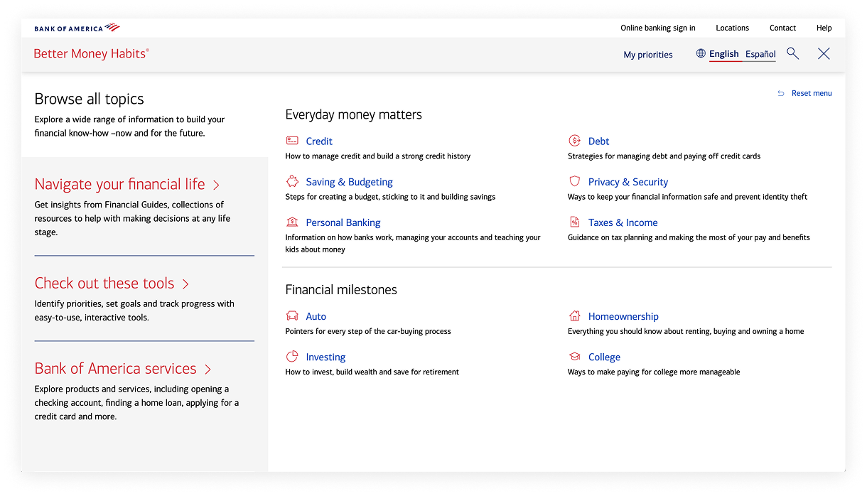
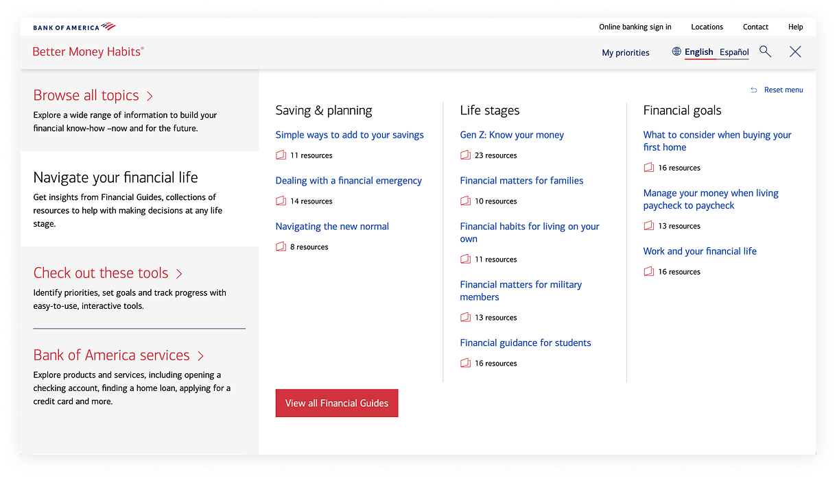
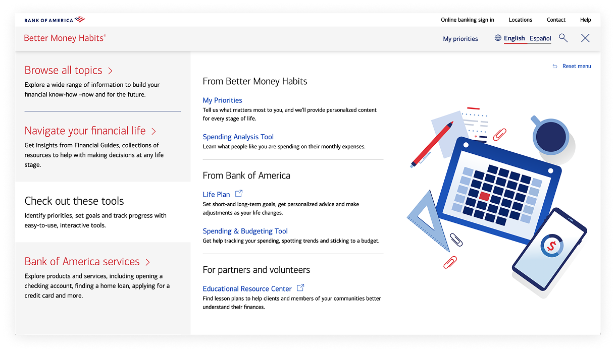
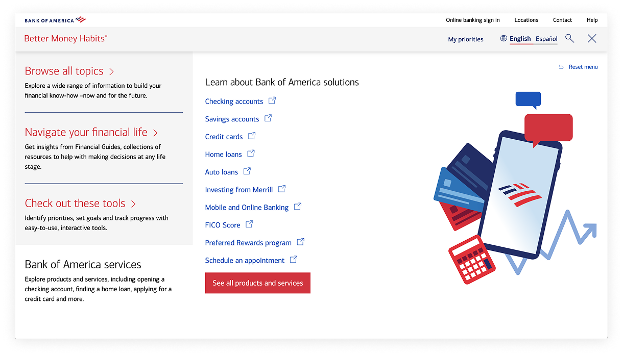
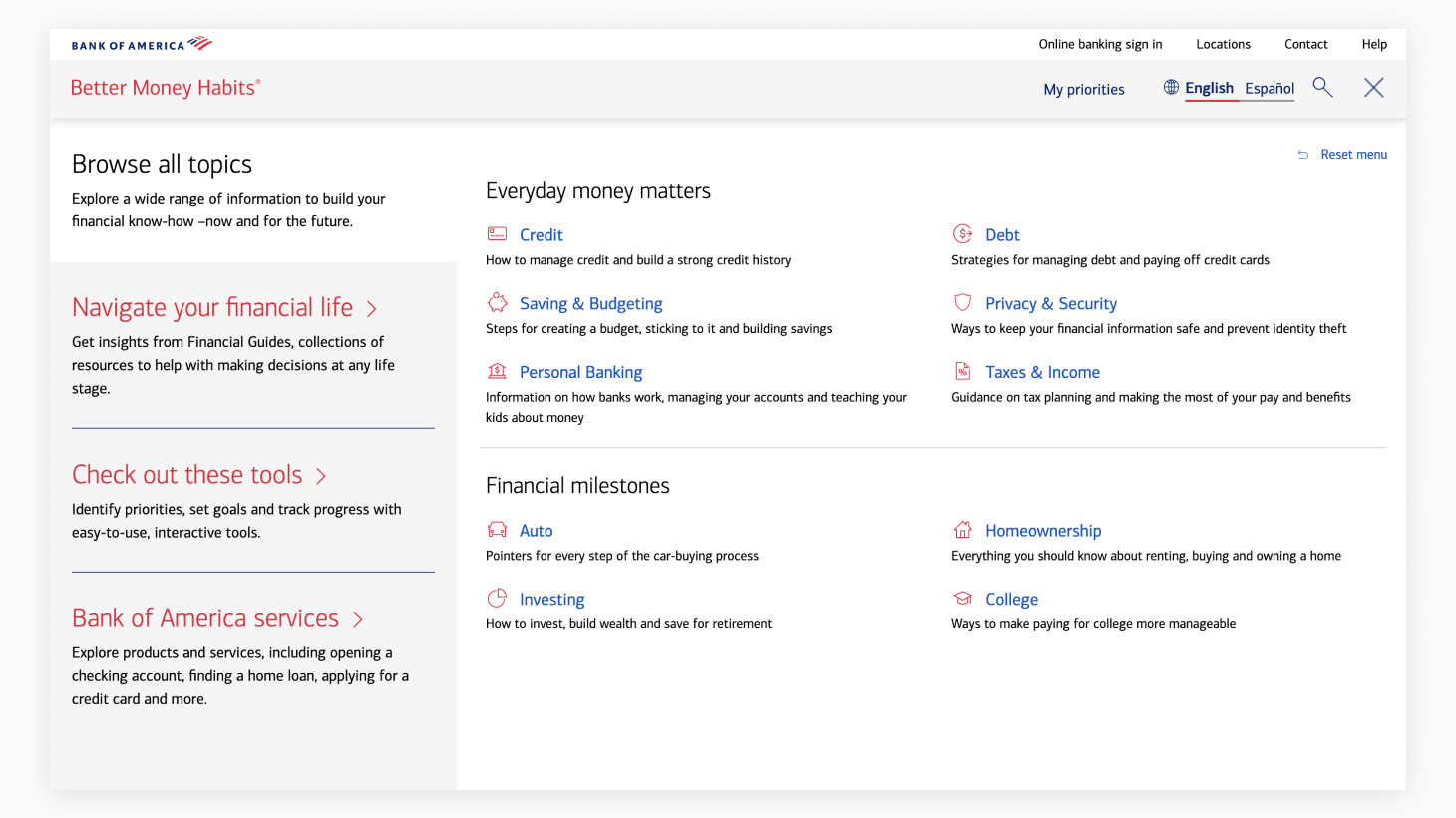
The team rebuilt the site IA around user goals, simplifying categories and labeling to support clearer, goal-based navigation.
Tree testing
Proposed structures were validated through tree testing to confirm users could easily locate key topics and tasks.
Wireframe design
Low-fidelity wireframes translated the IA into interactions, simplifying dropdown depth and improving visibility of key paths.
Wireframe testing
Testing measured clarity, label comprehension, and mobile usability, leading to refined groupings and simplified interaction patterns.
Visual design
Visual design applied enterprise system standards for hierarchy, spacing, and accessibility, reinforcing clarity and brand alignment.
Prototype testing
Final usability testing validated findability, user confidence, and task success within the updated, responsive navigation model.
What we learned
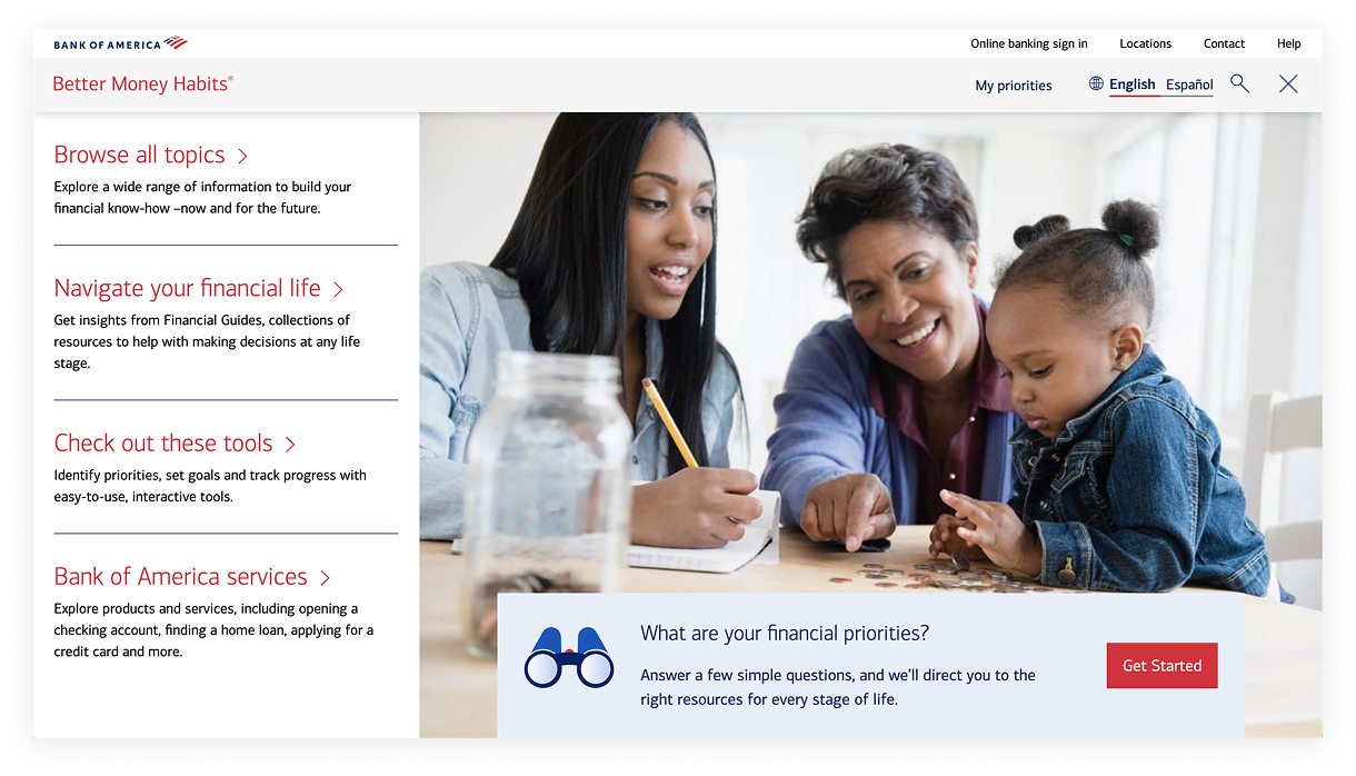
Visual context improved decision-making
Users preferred the version with an image default state because it gave them a moment to think before choosing.
Clarity mattered more than fewer clicks
Participants valued accuracy and confidence in their choices over speed or shallow navigation.
Information hierarchy built trust
A calm, organized structure helped users feel confident the site would deliver reliable financial guidance.
Brand trust came from clarity, not visibility
Users recognized Better Money Habits as part of Bank of America even without heavy logo presence.
- Navigation labels used internal, unclear language.
- Topics appeared in one dense, unscannable list.
- Menu felt flat with no clear starting point.
- Labels shifted to plain, goal-based terms users recognize.
- Content grouped into clear, visually distinct categories.
- Content grouped into four sections reflecting key user goals and journeys.
Outcomes & impact
Usability testing confirmed that the redesigned navigation made content easier to find and understand. Participants described the experience as simple and intuitive, and clearly recognized Better Money Habits as a financial education resource.
Improved comprehension
Users easily located content by topic and understood the difference between Financial Guides and Topics.
Stronger naming clarity
Nomenclature was viewed as helpful and user-friendly, reducing confusion.
Positive engagement
The majority found the amount of information “just right” and said the design “looked nice and clean.
Task success
Users confidently navigated to articles, tools, and educational content with minimal guidance.